|
Question:
Is there a relationship between the point structure of Le Monde and any commercial font of Times New Roman? The story I heard was that Porchez claimed Le Monde was point-pirated from TNR in the early 90s, but could not remember which particular version he pirated. Later, so I heard, he thought better of this story and denied it. Later still, John Hudson told me that Porchez hired Tiro Typeworks to redigitize Le Monde to remove all traces of the piracy.
Could the fonts themselves establish if there was any basis to these stories? Comparisons: |
||
|
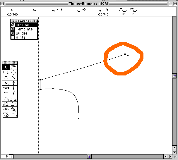
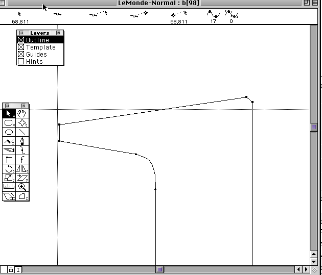
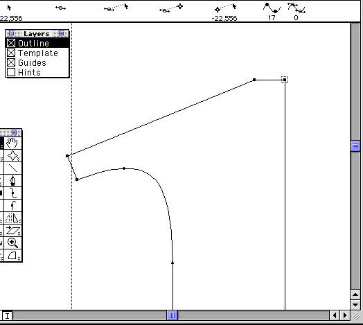
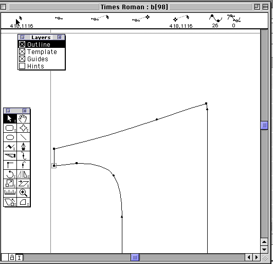
Comparing Le Monde 94 to the Times fonts, I zeroed in on 1993 Adobe Times (supplied with Illustrator 6) because of the unusual digital structure of the top stem of b.
|
 |
|
|
Le Monde uses the same unusual structure for all of the relevant characters: d, h, i (most unusually), j, k, l, m, n, p, q, r, etc.
|
 |
|
|
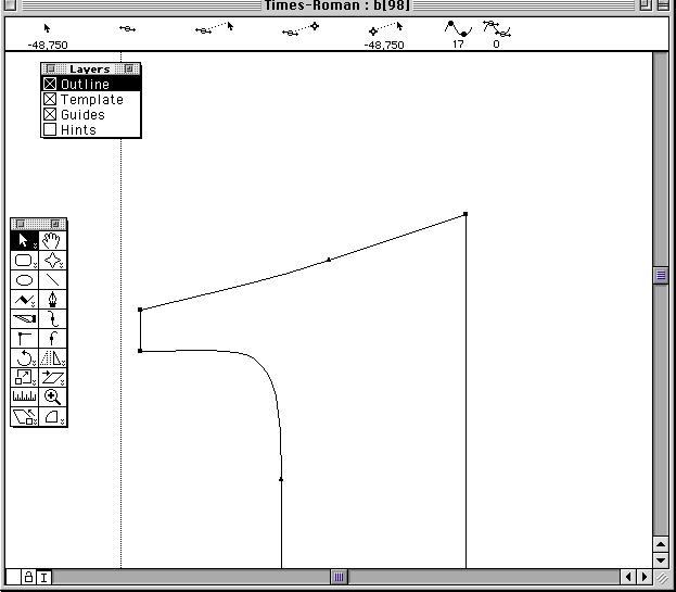
In no other font of Times could I find this structure. Here is Adobe Times from 1989.
|
 |
|
|
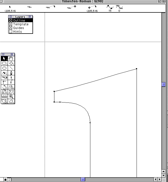
Adobe/Lino Times Ten
|
 |
|
|
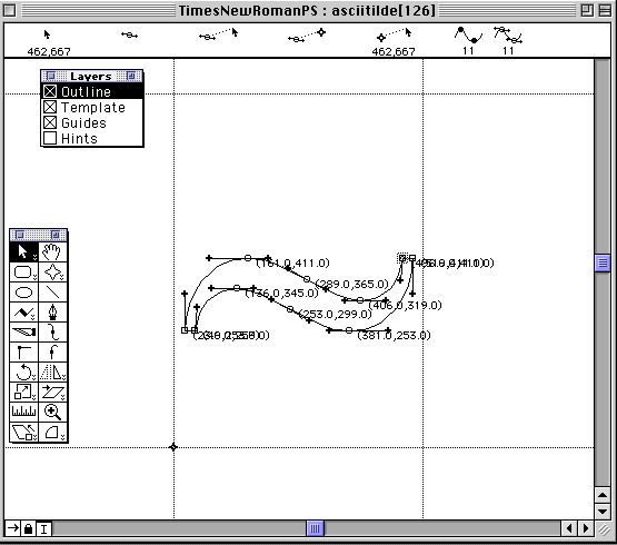
Adobe/Mono TNR PS (this seems to be the version of Times that Porchez used to illustrate the pdf on Gary Munch's site which does not show any of the characters discussed here)
|
 |
|
|
Apple TNR
|
 |
|
|
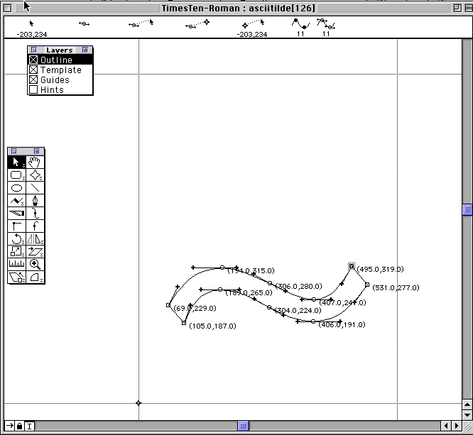
Other clues?
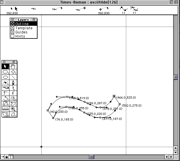
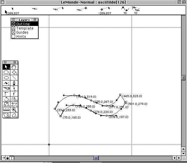
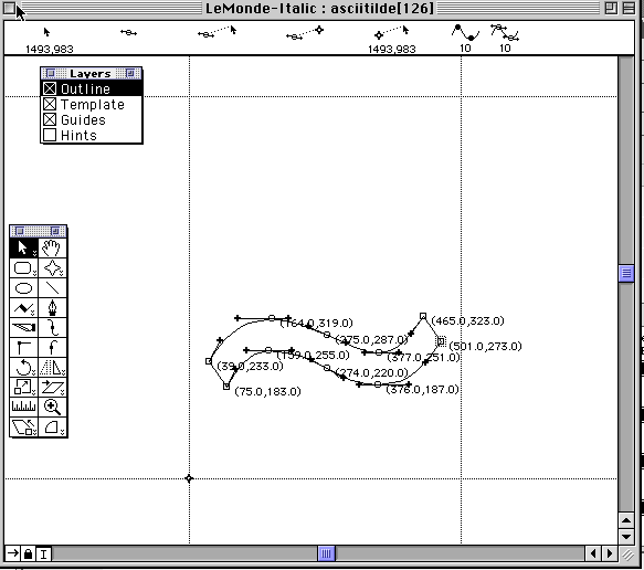
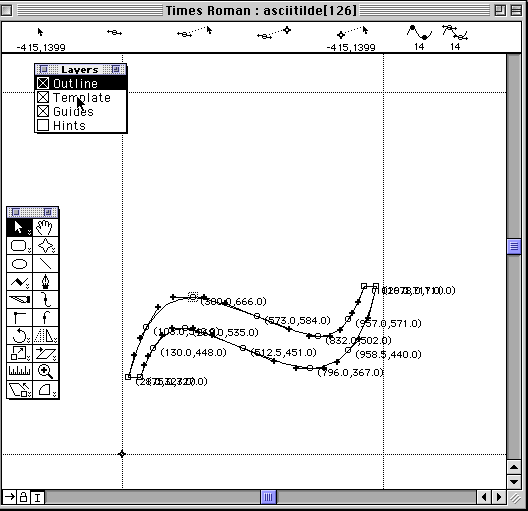
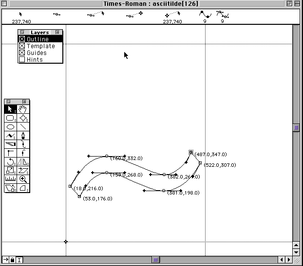
In the asciitilde character the two glyphs were perfectly identical except that the Le Monde points had all been horizontally shifted left by exactly one unit. Coincidence? .
I found a a few dozen other identical glyphs in 93 Adobe TNR and 94 Le Monde. They were not identical or even similar to any other font of Times New Roman that I had, or any other font I could find. |
||
|
93 Adobe TNR
|
 |
|
|
94 Le Monde
|
 |
|
|
94 Le Monde Italic
|
 |
|
|
Apple TNR
|
 |
|
|
1989 Adobe TNR
|
 |
|
|
Mono/Adobe TNR PS
|
 |
|
|
Lino/Adobe Times Ten
|
 |
|